- Background
- Objectives
- Research
- Proposed Solution & Features
- The Stack
- Outcome
- Challenges & Lessons Learned
Background
This is month three of my learning to code by building products each month.
For this project, I wanted to build a small platform that would allow users to sign up with a really quick onboarding process. I also wanted it to be able to take payments.
Objectives
Learning Objectives
My goal is to be able to rapidly build prototypes for product ideas. After a number of conversations, I decided I would start with Ruby and Rails as my language and framework of choice. After more research, I decided it I wanted to get the following out of this project:
- Implement the ability to take card payments
- Figure out a business model that will make sense for users
- Get comfortable navigating Rails and MVC
- Allow users to upload images in Production to AWS
Product Objectives
As mentioned with other projects, I want to get to the point where I can launch high-quality prototypes. I believe it is important to focus on the product as much as the code. To achieve this, I set objectives for the end result as well as the code:
- A fuctioning web app
- Address real problems, highlighted by potential users
- Create a professional look and feel
- Clearly communicate what the product does
- Sit through user testing
Research
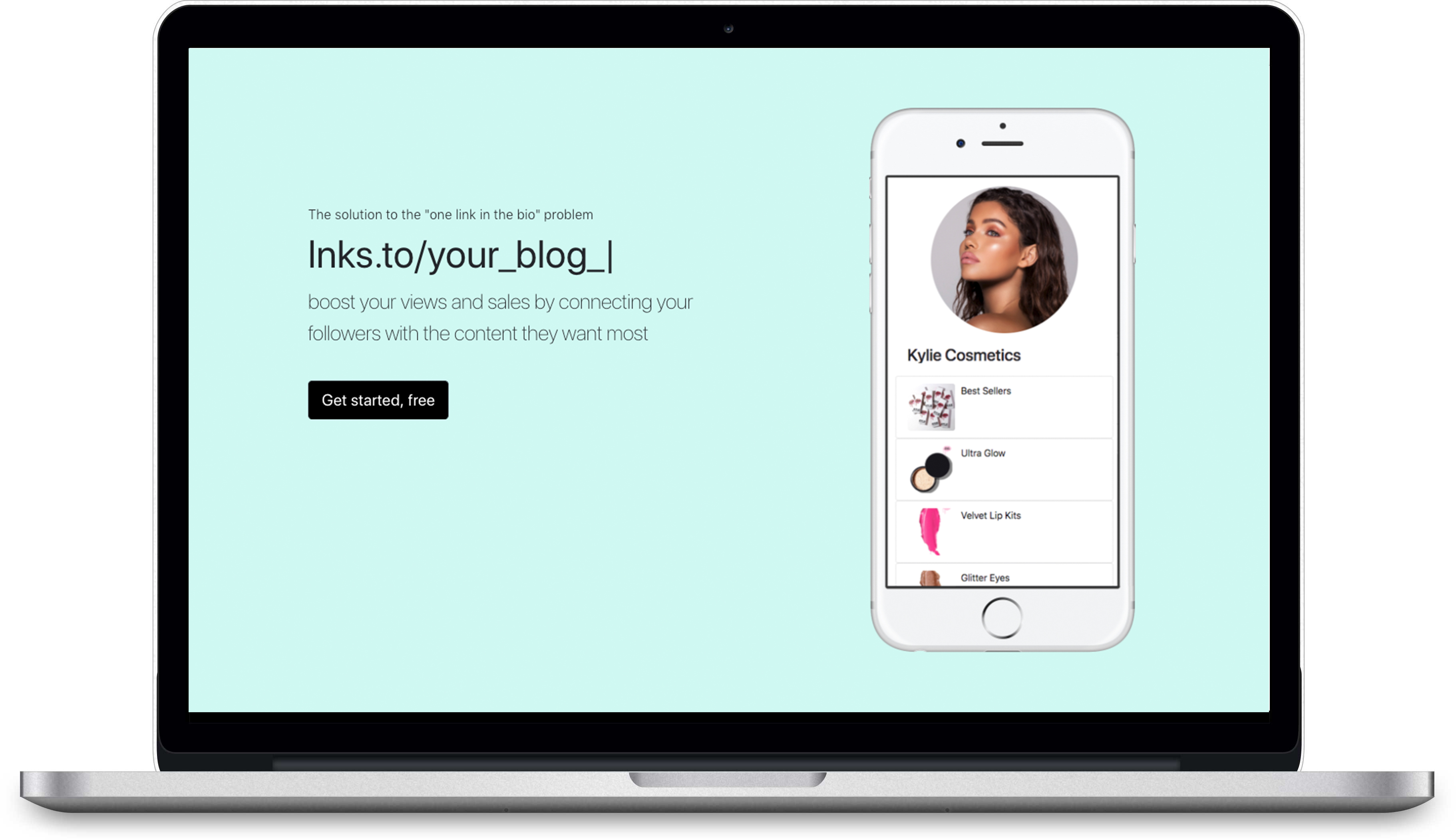
I have spent a lot of time marketing on Social Media, particualrly on Instagram. While trying to build brands and communities on Instagram one of the problems you come across very quickly is the 'one link in the bio' challenge.
For influencers and eCommerce managers, this can be a big problem because they are constantly sharing different products or content in their feed. As you can't add clickable links to posts and are restricted to one link in the bio, followers struggle to find the content or products being promoted in posts. This means business owners are missing out on sales and valueable traffic.
Challenges faced by potential users
- Need to share multiple links in bio
- Social media profiles
- Links to blog posts
- Links to products
- About pages
- Affiliate links
- Mobile friendly
- Quick to setup
- Easy to communicate links relevant to followers
- Reflect their brand
- Communicate importance of links
Proposed Solution & Features

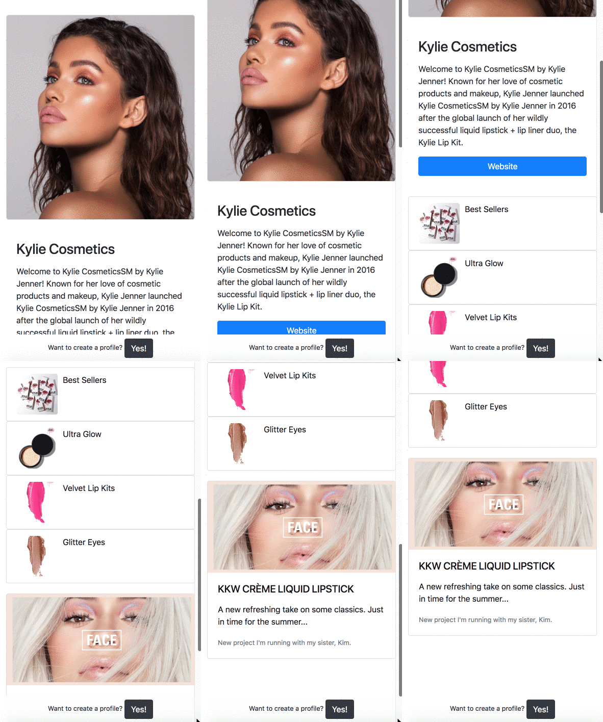
The solution I came up with was to create a platfrom that would allow users to quickly create profiles that would refelect their brand and allow them to add a list of links to the profile. The focus throughout the platform would be speed and simplicity.
Objectives
- Sub 10 minute onboarding process
- Mobile first
- Flexible, to empower all types of social media brands
- Clean and easy to navigate user interface
- Ability to unlock premium features by purchasing a subscription
With these objectives in mind, I then went on to create a list of features in Notion that I believed would appeal to users.
As usual, once I had the list of features mapped out in Notion, I prioritised them and started addressing them one-by-one. You can watch a short video on how I manage features and bugs here.
The Stack
My aim when selecting the stack was to make the project as close to a production ready app as possible, but also not to get bogged down with time consuming things which add little value.
I wanted to focus on learning and exploring Rails it's self, rather than Gems and additional features. As a result, I made decisions like using a PostgresQL database, even in the development environment. I also decided to limit the number of Gems I used so I would focus more on the Rails framework than tempting addons. However, I did use a few Gems to speed up the development process like Bootsrap 4 and, Devise for signups and authentication.
- Bootstrap (Customised to clean up the look and feel)
- HTML5
- CSS3
- JavaScript
- Ruby On Rails
- PostgresQL
- Gems:
- Devise
- Bootstrap 4
- Saas Rails
Outcome

I'm really happy with how this project turned out.
I've got some great feedback, a couple of people have said they would use it in the wild because it solves a problem they have come across. Also, while building it, I stumbled across some competing products that do a similar thing. So, there could be a maket for it.
With reards to my objectives, I managed to acheve a all of them, but as with many projects - once you get started you come up with more and more ideas that seem to add value. I haven't got too caught up in those just yet, but there are more thing I plan to add. For now, I have managed to tick off my main objectives. I'm most proud of these...
Sub 10 min onboarding time
After a couple of walkthroughs, I managed to get the onboarding process down to 3 minutes. This means people who are totally new to the app, can stumble across it and from the moment they click on the 'signup' button, to publishing their first profile can be done in 3 minutes.
Flexible, to empower all types of social media brands
After demoing a few of the features I came up with, I got comments from users about how they thought features like 'Cards', would be really useful for helping promotions stand out. For one individual, they said the design and the cards feature would make them select my platform over my compeitors and it would help drive sales and conversions for their business.
Users would also quickly get an idea of how it could be adapted to their brand and began to request features like themes. This shows that they bought into the idea and was true for both an influencer and an eCommerce owner I spoke to.
Challanges & lessons learned
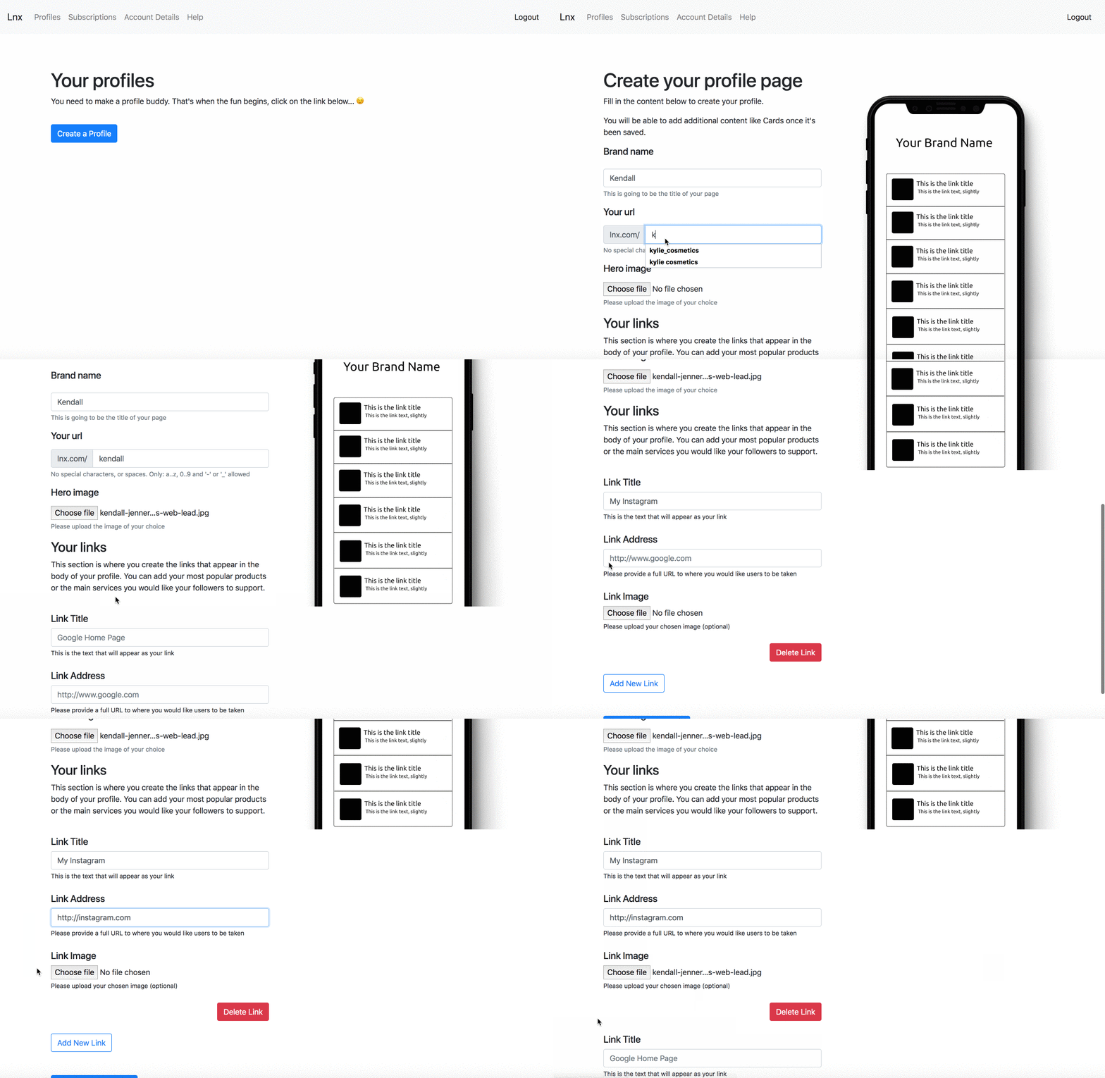
Overall, this was a really simple idea when compared to most SaaS products but it did have a few challenges for me. Until this point, I'd never worked with an API (used for processing payments with Stripe). Funnily enough this wasn't the biggest issue with this project. The biggest issue has been with what I assumed would be one of the more simple features: adding Vanity URLs / Slugs to profiles. These are both crutial features and have proven to be a challenge for multiple users.
Many users had never heard the terms 'vanity URL' or 'slug'. This was a surprise to me as they are so common amoungst social media profiles. It's how you set up the link to your profile so your username ends up being, "socialmediasite.com/your_name".
Almost every user failed to complete this step successfully, despite instuctions by the box added special characters or spaces.

This is a massive problem because once they save the page, they are directed to view it and the platform finds the page with the Vanity URL. So I needed to learn how to add validations to solve this.
Validations are also needed to work out if people have added the correct link format.
When users add links, they can either add 'http://' or 'https://'. If they don't the link currently won't work. I need ot add a validation process that checks links before they are added. This is possible and I will implement it, but I am still in the process of researching the best way to do so.
As I said earlier, this project has been a lot of fun, I've really enjoyed it and plan to continue to work on it into the future. Possibly launch it as a paid product, but it need some essentials fixed before I would be comfortable putting it out in the wild. Overall, I'm really excited about how far I have come in what feels like a short space of time. I can't imagine what I'd be able to build by the end of the year.
If you'd like to have a play with the app and create a profile, click here...
It would be great to hear any feedback or comments you might have. You can ping them over to my twitter account as I haven't added a comments section to this site, yet.
